DSC Labs' RED CamBook

DSC Labs' RED CamBook

I recently obtained one of these new RED CamBooks and in my opinion, it's one of DSC Labs' most useful products to date.

redbook1.jpg

http://dsclabs-us.intelex.ca/product.php?product_id=143

While this product does bear RED's name, seeing as how there's no way to adjust RED's colorimetry in the camera other than some basic phase, saturation, and white balance controls, I fail to see why this is marketed as a "RED specific" tool. Yeah you can shoot the chart and use it to make picture adjustments after the fact but because it's a full 28 swatch Chroma Du Monde chart that fits it your laptop bag, it's also incredibly useful for painting and matching traditional HD video cameras. The other small cambooks DSC had sold prior to this don't have the full range of video colors as found on the full size CDM 28 chart.

redbook2.jpg

This small "to go" Chroma Du Monde is exactly the same as the full size version in terms of video colors and tonality. Because of the size it can easily travel and if you find yourself matching cameras in a hotel room in the middle of nowhere, you can now do so with a far greater degree of precision than with the older, 6 or 12 video color CamBooks.

match.jpg

A new feature to the chart is the addition of 6 super saturated, non-calibrated primary colors on the outside of the CDM. This is apparently a feature RED requested as the Chroma Du Monde colors are low saturation and intended to be normal, life-like colors (hence the name, "Color of the World"). The 6 non-calibrated colors are intended to be used as a visual reference so you can quickly glance at the monitor and confirm that the camera is still seeing high-sat even if you've calibrated to the low-sat colors. It's an interesting feature. I personally haven't found myself using it but you never know.

I recently used the RED CamBook to have a look at the new RED Mysterium-X sensor across the entire range of camera ISO's and made some very interesting discoveries. Until next time..

Update

on 2010-07-13 04:35 by Ben Cain

Nice to see there's quite a bit of online activity at the moment regarding the RED CamBook. Maybe I wasn't clear enough in my original post but yes, I do realize how this product was intended to be used with the RED and that is to align the camera image to the chart or multiple cameras to the chart in post production. With a camera like this, the emphasis is always on what can be done with the images in post production though with the new RedColor color science and RedGamma, you can now get much closer to your preferred look right in the camera. However like I mentioned, because of it what it is, a full swatch Chroma Du Monde, it's also very handy for use with more "conventional" Rec709 video cameras. 

Interesting Canon Tidbit..

Interesting Canon Tidbit..

Jem Schofield and I were at Sekonic USA the other day testing several of their light meters against multiple Canon HDSLR's and we found an interesting little fact. 

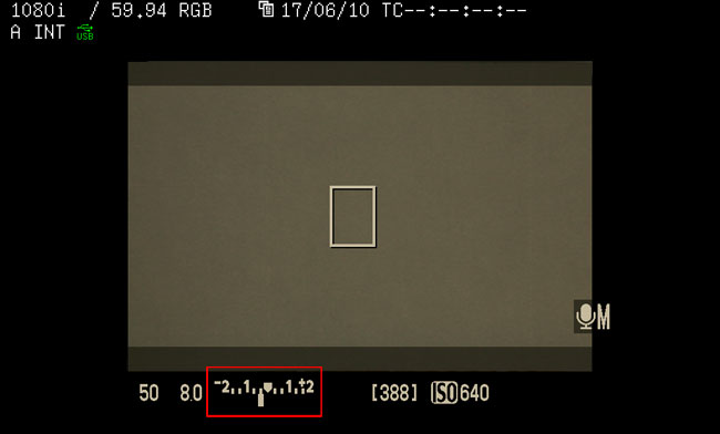
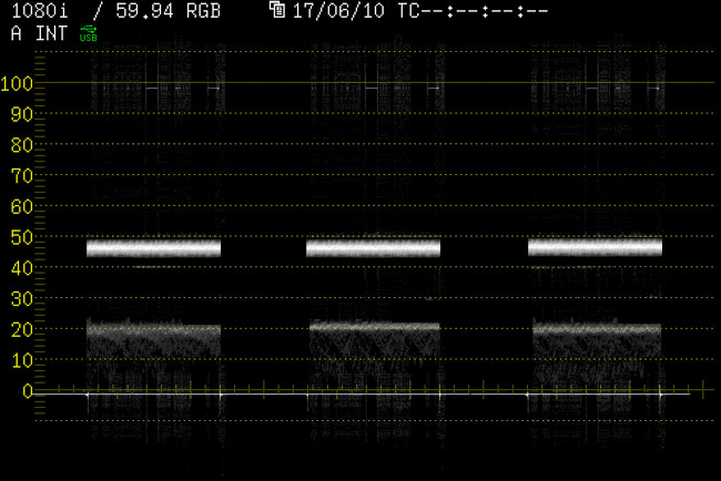
The test was very basic - evenly light a Kodak 18% reflectance gray card, convert the HDMI video signal to SDI and then measure it on the waveform, set the exposure in the camera so that card reads an even 47% (47 IRE) across, match the ISO and shutter speed on the Sekonic meter to the camera, take an incident light reading and see if the F Stop on the meter is the same on the camera. 

We tested 4x Canon 7D's and 2x Canon 5D Mark 2's. With every single camera, setting the stop on the lens to the incident light reading on the gray card rendered the middle gray correctly in the 45-50 IRE zone. 

What this means is that Sekonic meters, out of the box, are very well calibrated to the standard ISO table as are Canon cameras. I'm much more of a waveform user but if I don't have access to my scope, knowing that I can accurately and repeatably use a light meter to help me judge exposure on these sometimes difficult to evaluate cameras is good to know. 

Here's what's interesting though - as you know, these Canon cameras include a built in multi-point reflective light meter that you can call up when rolling video by depressing the shutter button halfway. I've gotten in the habit of using this a lot and have found that setting the exposure to -1/3 or -2/3 under from the middle, "prefect exposure" zone has yielded the best results. On all 6 cameras, setting the ideal exposure on the gray card and then checking the camera's internal reflected reading yielded the same results, -1/3 underexposed. See illustrations below:

canon_gray2.jpg
canon_gray1.jpg

To re-hash, on all 6 Canon cameras we tested, setting the gray card to an ideal exposure using the waveform monitor resulted in the camera's internal meter telling us that the image was 1/3 stop underexposed. In my experience using this built-in camera meter, setting an exposure in this 1/3 or 2/3 underexposed zone has yielded the best results so this test basically confirmed how I was already working with the camera. 

What this means is that if you're exposing for midtones and using the built-in Canon meter, if you set your exposure in the middle of the scale, you'll be overexposing by about 1/3 stop. Just something to be aware of. 

RED Build 30 and Chroma Du Monde

RED Build 30 and Chroma Du Monde

Want to see what a DSC Lab's Chroma Du Monde chart looks like on scopes using the RED One's new RedColor Color Science? I did. Here it is.

RED One Mysterium-X, RedColor, ISO 500, 3400k

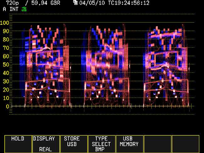
Screen Capture from 720p Preview Raster:

main.jpg

And on the Vectorscope (Gain x2):

field_vector.jpg

When I first worked with this new firmware build, I had reported that the colors on the video preview seemed odd to me. Looking at the CDM chart, I'm a little surprised that they actually line up on the scope closer than I would have thought. Red, Yellow, and Blue are pretty faithful whereas Cyan, Green, and Magenta are a bit de-saturated and out of alignment in comparison. Sadly, there's no way to modify this matrix other than basic saturation, white balance, and Green/Magenta Tint. As of this build, there's also no other preview choice as Rec709 and RedSpace are no longer part of the program. I'm not crazy about RedColor but in terms of tonality I'd say it's more closely aligned with what you're seeing in VIEW RAW mode. RedColor seems to take that View Raw image, increase the overall exposure according to the ISO, put it into whatever White Balance / Tint you've selected, apply this new color gamut, and then pump up the saturation. Additionally, if you're working at the camera's native white balance of 5000k and native ISO of 320 (I'd say 320 is a good bet), toggling between the two modes shows not much difference in the exposure histograms. This is obviously quite a bit different than previous versions of the camera.

Now the elusive task of rendering the R3D files to look like the picture everyone fell in love with on the monitor. In the past, this was far more problematic. Even if files were rendered with the camera metadata and a little cleanup was done in Red Alert, the resulting video or DPX stacks were often substantially different than what you were seeing on-set. As of Build 30, you can now render in RedGamma and RedColor with the camera metadata and the resulting picture is far closer to the image seen on the video preview.

Here's the R3D of the chart seen on the Vectorscope, rendered to ProRes HQ in Red Cine-X using the defaults - RedColor and RedGamma, with the camera metadata. No adjustments or cleanup were made to the file. The Red is the Video Preview and the Blue is the resulting render.

rc_compared_vector.jpg

As you can see, the colors are intact but aren't as saturated as what you were seeing on-set.

And the RedColor Waveform: Again, the Red is the Video Preview and the Blue is the resulting render.

rc_compared_wfm.jpg

It's actually pretty close. The midtones are there but the blacks are a little lifted and highlights are a little compressed compared to the Preview. If you know this and the production liked what they were seeing on the monitor, you can do a camera metadata render but just apply a little saturation, apply a light curve to increase the contrast, and get back to where you started very quickly and easily.

As a point of comparison, let's take the same file, render with the camera metadata but instead of using RedColor and RedGamma, put both into Rec709.

RedColor vs. Rec709 Vectorscope: The Red is the RedColor Video Preview and the Blue is the resulting Rec709 render. No adjustments or clean up was made to the file.

709_compared_vector.jpg

Safe to say, this color space is quite different.

And the RedColor vs. Rec709 Waveform: Red is the RedColor Video Preview and the Blue is the resulting Rec709 render.

709_compared_wfm.jpg

The Rec709 default render is very flat and compressed in comparison and requires some curve adjustment if you want any semblance of contrast in the image.

Why is this useful to anyone? Most people don't use scopes with the RED but if you choose to do so, they can be used to accurately monitor the picture that can be easily recreated later with camera meta data. This little "test" was done to satisfy my own curiosity more than anything else. I like to know what I'm working with.

So who's looking forward to direct ProRes HQ capture on the Alexa?